
Logos and typography of 2006
Date published: March 17, 2006
On the topic of green circular logos, Quark announced another new logo yesterday. Some may recall that back in September, Quark announced a new, much more minimal logo that ended up being almost exactly the same as the logo for the Scottish Arts Council. Talk about having egg on your face! Quark is known for it's design software, and the fact that they created a logo that is basically already in use really is a knock against them. Then again, some would argue that the company is just dying a slow death anyway, putting money and time into coming up with a logo instead of improving the user interface and function of their software. Saying "there is third party software to accomplish that task" only goes so far.
Regardless of all that, I like their new logo. Not as minimal as the previous one, but at least it's got to be more unique.
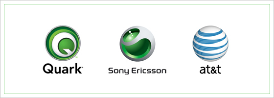
Some were saying that the new Quark logo reminds them of the Sony Ericsson. A quick glance at the Sony Ericsson logo does show some similarities, but there is no doubt that they are completely different. Likewise with the new AT&T logo, it reminds me of the Sony Ericsson logo, if only because of they're both 3D hollow spheres.
Over the past many months I've come across some interesting websites discussing recent trends in logo and type usage. Really, the reason why I wanted to make this post wasn't to discuss Quark's new logo, it was to call attention to two interesting links.
-
The Logos of Web 2.0
a discussion about recent type trends, boiled down to four categories: softies, futurists, classics, and new classics. Also, don't miss the link in that write-up to Ludwig Gatzke’s compilation of nearly 400 Web 2.0 logos. -
Chris Glass's posts on logos
Chris has made some interesting observations on logo evolution over the years. Though I've never even met him, he seems like a cool, smart designer.